Main Track Feature: track visualisation
The visualization of tracks is a one important feature of this app. The track visualization is done by drawing colored lines on top of the visible map layers.
A track is represented by a TrackLog object - please check the track definitions.
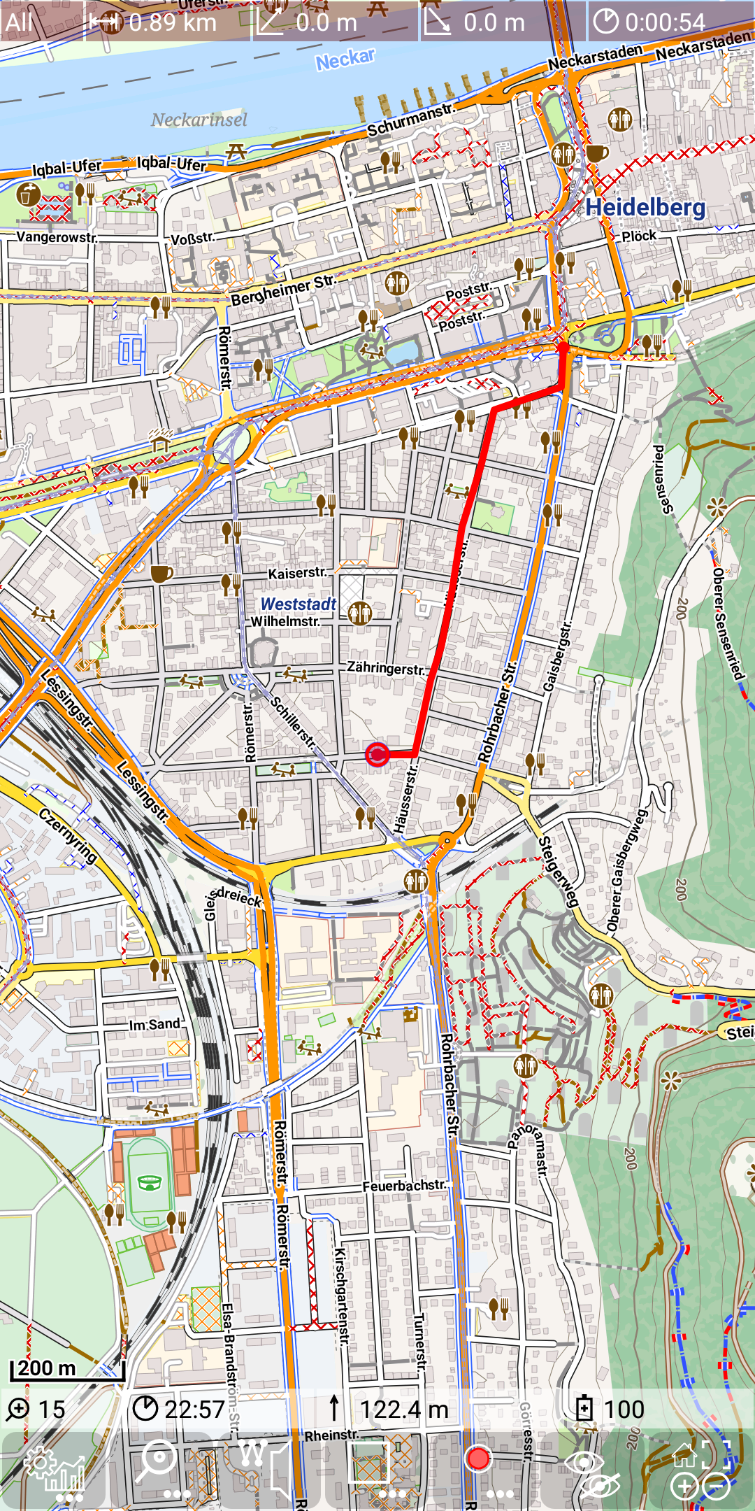
The following pictures show:
- a RecordingTrackLog (red line)
- multiple available tracks (green lines) and a selected track (blue line)
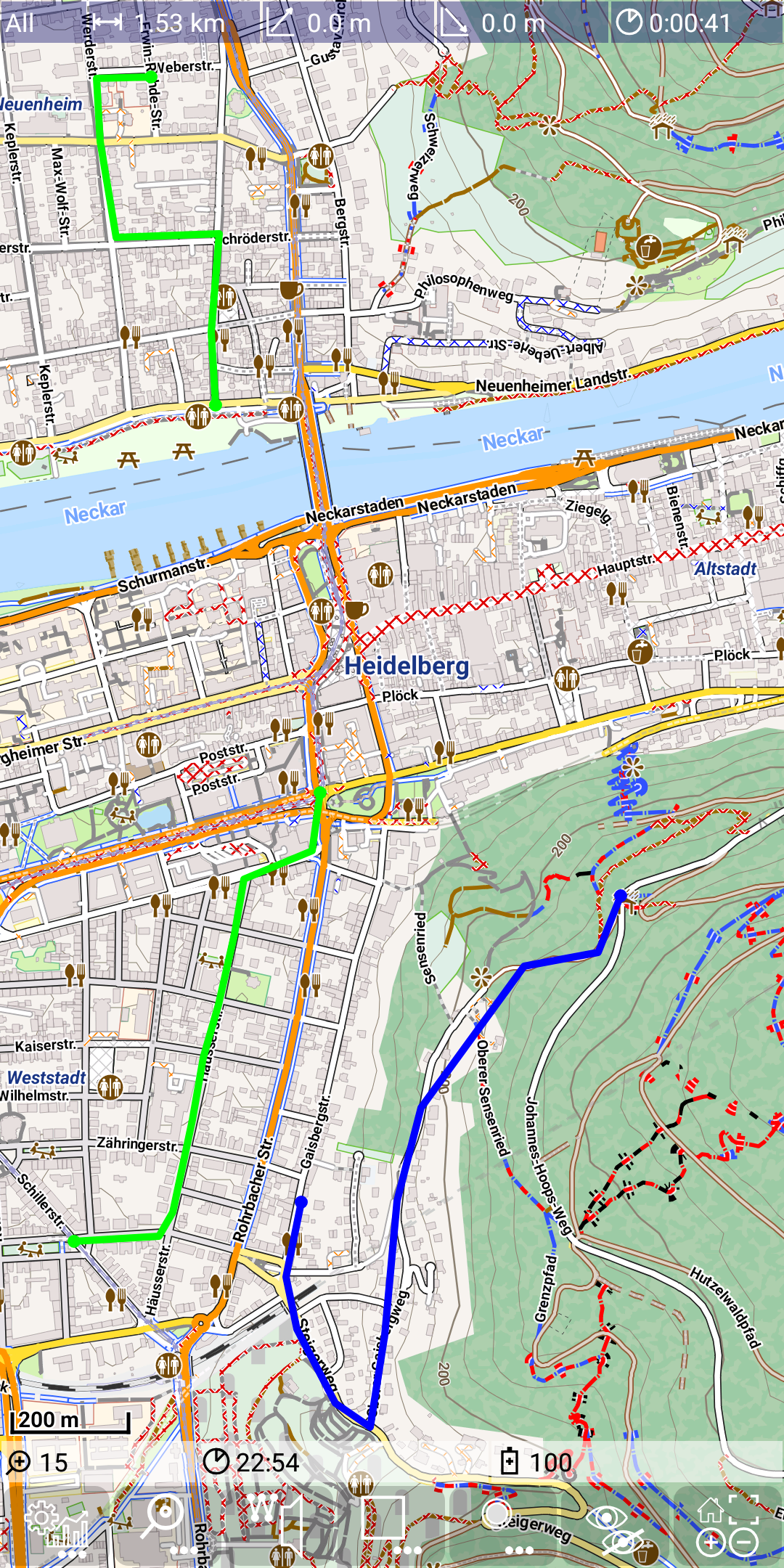
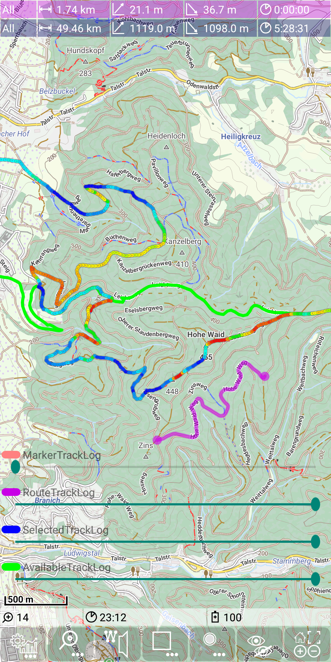
Beside these three types of visualized tracks there might be also a a route track (purple line) visible. Out of these 4 types of tracks there are three of them (recording track, route track and selected track), which allow an alternative gain/loss representation of this track.
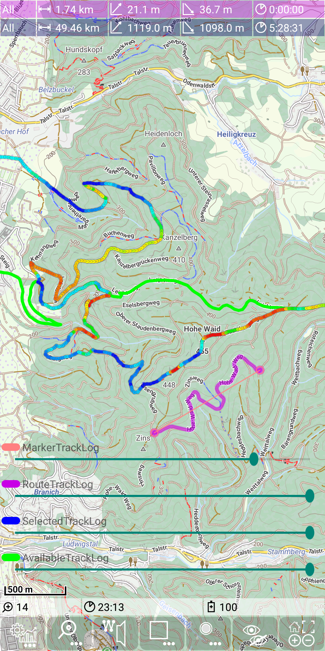
The following picture shows an selected track with gain/loss representation switched on.
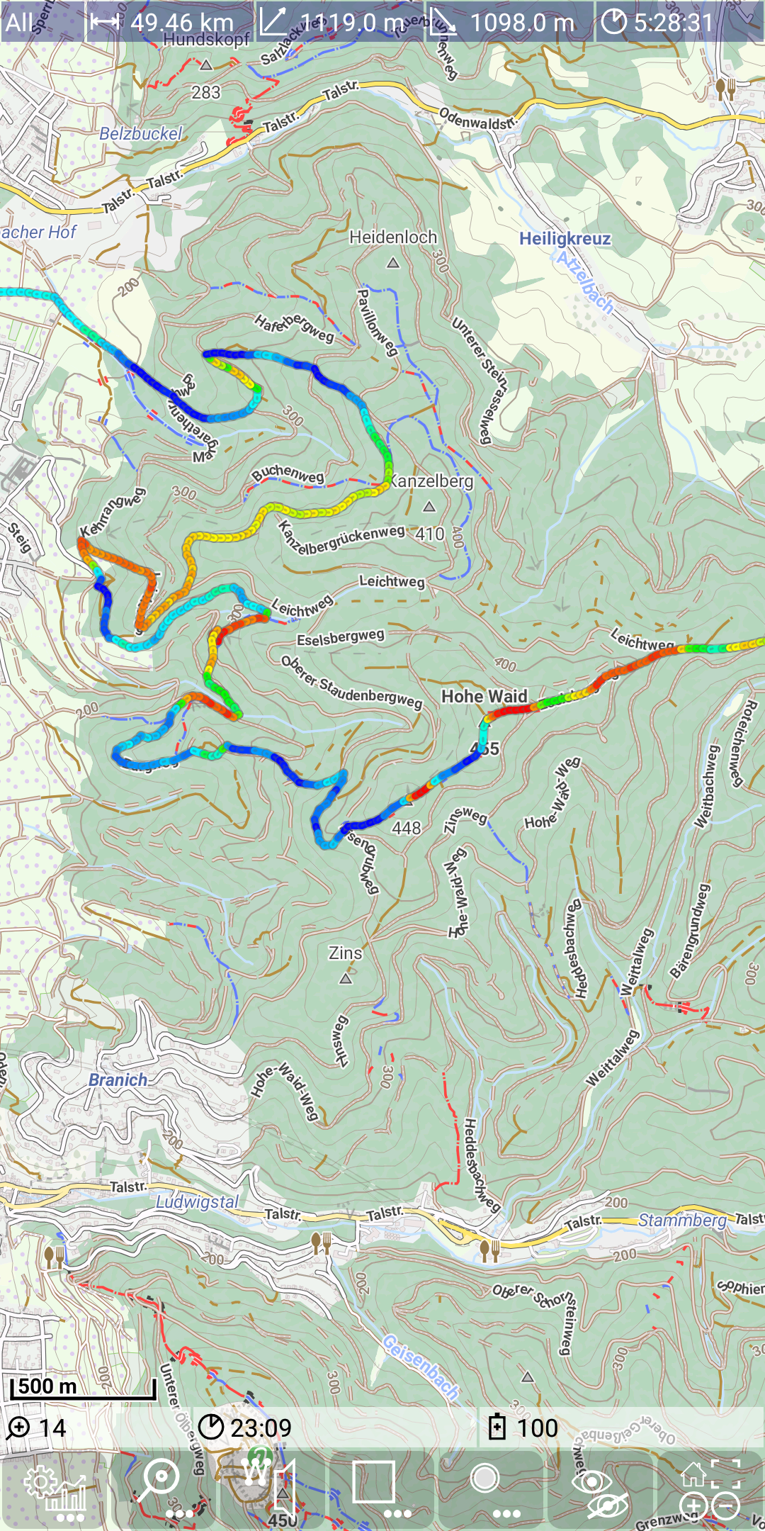
Colored depending on gain/loss means
- drak blue: steep descending
- light blue: moderate descending
- green: not ascending/descending
- yellow: moderate ascending
- red: steep ascending
Use the Statistic activity to load tracks as available, selected and marker track.
Controls for track visualization
Track controls
 |
 |
 |
 |
|
|---|---|---|---|---|
| short tap | when on point: delete point on line: insert new point |
make this track to the selected | ||
| long tap | toggle gain/loss mode | toggle gain/loss mode | toggle gain/loss mode |
Track transparency
It is possible to control the transparency for all track types. To do this use
![]() +
+ ![]() .
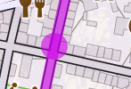
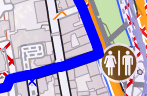
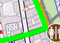
The next figures show an example of the usage: First the marker track is invisible, while in the second figure the transparency of the marker track is reduced, so it becomes well visible.
.
The next figures show an example of the usage: First the marker track is invisible, while in the second figure the transparency of the marker track is reduced, so it becomes well visible.
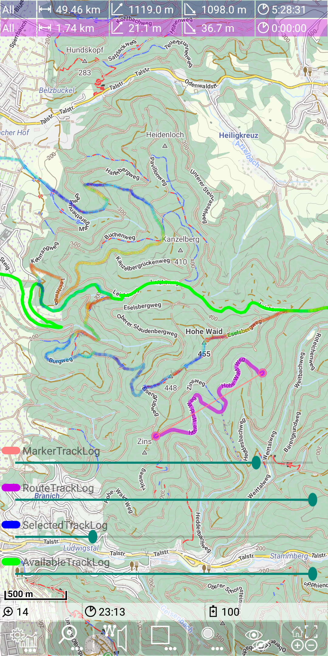
As a second example we increase transparency of the selected track. So the other available (green) track becomes much better visible and also the map properties are better visible.
There is no control for the recording track log visible, since there is currently no recording track. Switch off the track transparency controls again with
![]() +
+ ![]() .
.